Mercado Pago
Redesigning a payment flow for scalability
How a redesign allowed a flow to reach new markets, better and faster payments for merchants.

DURATION
ROLE
UX TEAM
TEAM
Context
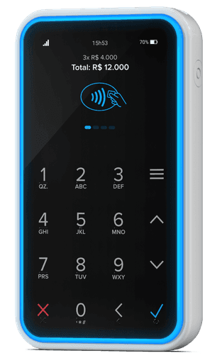
The Mercado Pago mobile payment flow allows small sellers and merchants to accept card payments using their smartphone, paired with a small card-reading device.
This flow was initially launched four years prior to this project and hadn’t undergone design updates during that time. The way it was originally built made it difficult to scale and implement improvements.
Project goals
Refactor the architecture of the payment flow to support scalability and enable faster launches in new countries.
UX goals
Design a modular version of the flow that can easily scale to multiple countries and markets.
Introduce UI improvements to enhance performance across devices and refresh the look and feel while maintaining familiarity for current users.
Design process
Research
The card payment flow is used in physical, in-person sales environments. We applied a service design approach, and the user research team conducted observation sessions with users to understand how they interact with the product in context.
KEY INSIGHTS
•
Speed and agility in processing payments are the most valued aspects.
•
Users are highly familiar with the steps and screen layouts, navigating them very quickly.
•
The payment flow is used across a wide range of smartphones.
•
Some steps are managed by the seller, while others involve the payer, who may be unfamiliar with our specific flow. Payers are typically casual users who encounter different payment terminals at various stores.
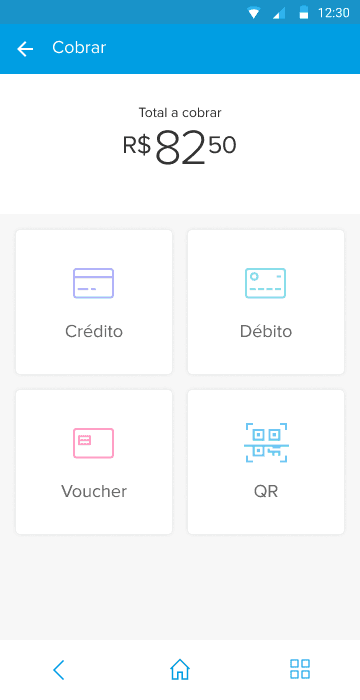
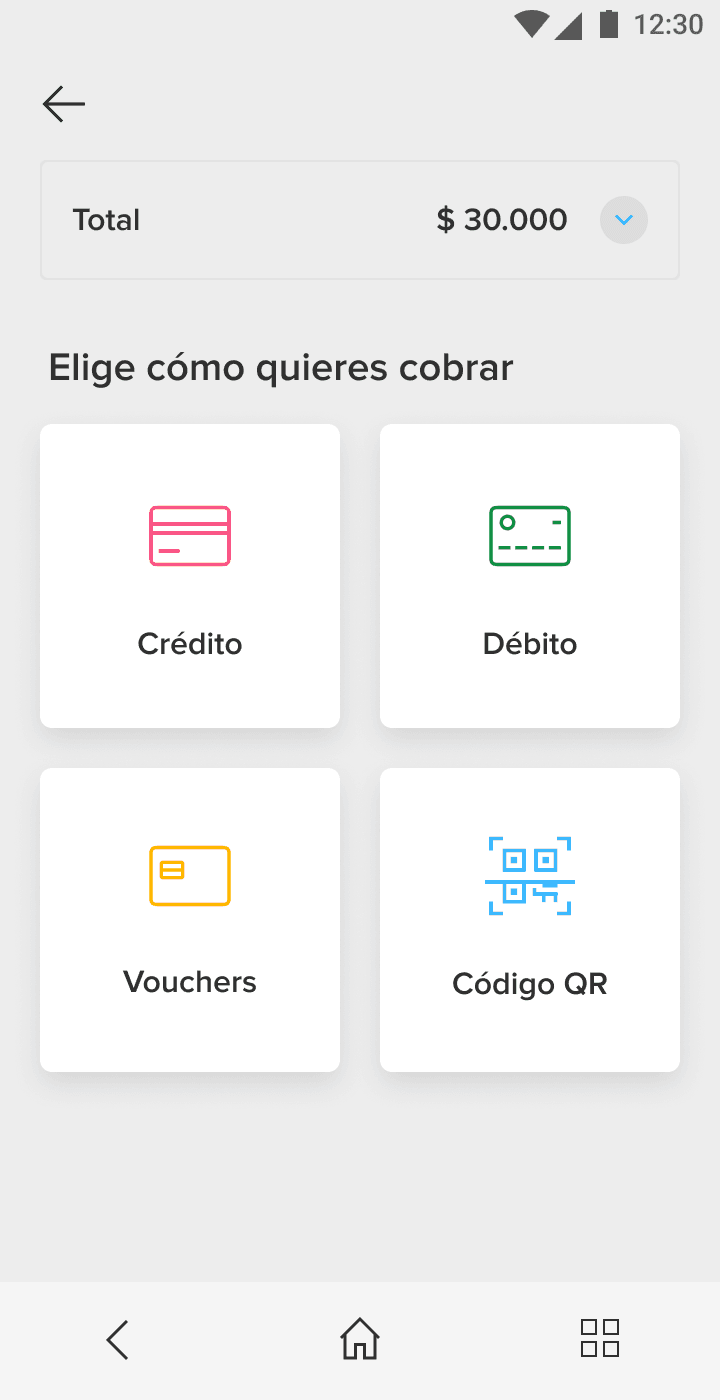
Existing payment flow
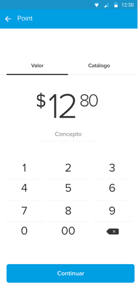

Scalable layout
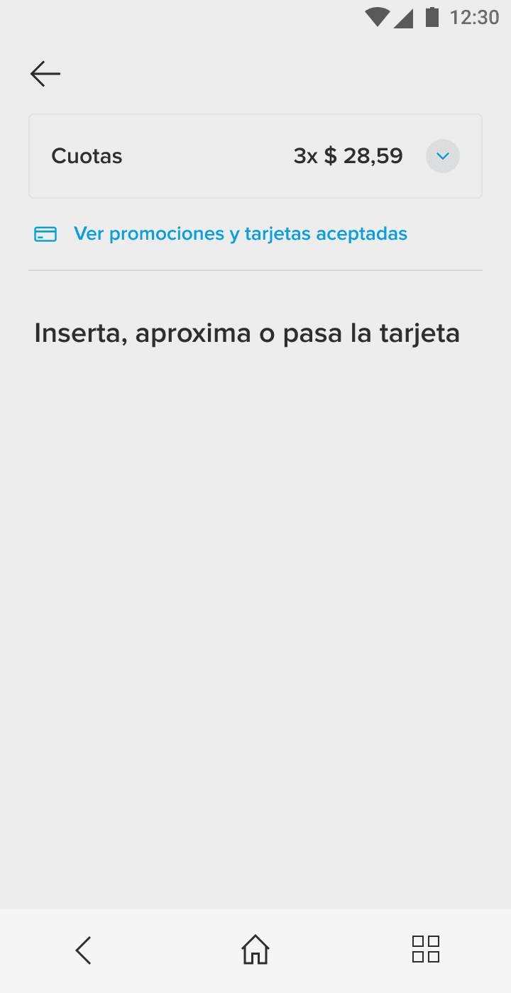
We standardized the layout across screens for a cleaner design, drawing more attention to the actionable areas. I also unified text positions and styles to improve readability.
This standardized structure allows each step to be independent of its order in the flow, which was a critical factor in enabling scalability across different countries, each with its own payment steps.
Existing payment flow
Informative area
Actionable area
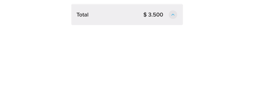
I designed an expandable component to display the most relevant information throughout the flow, which can be expanded for further details when needed.
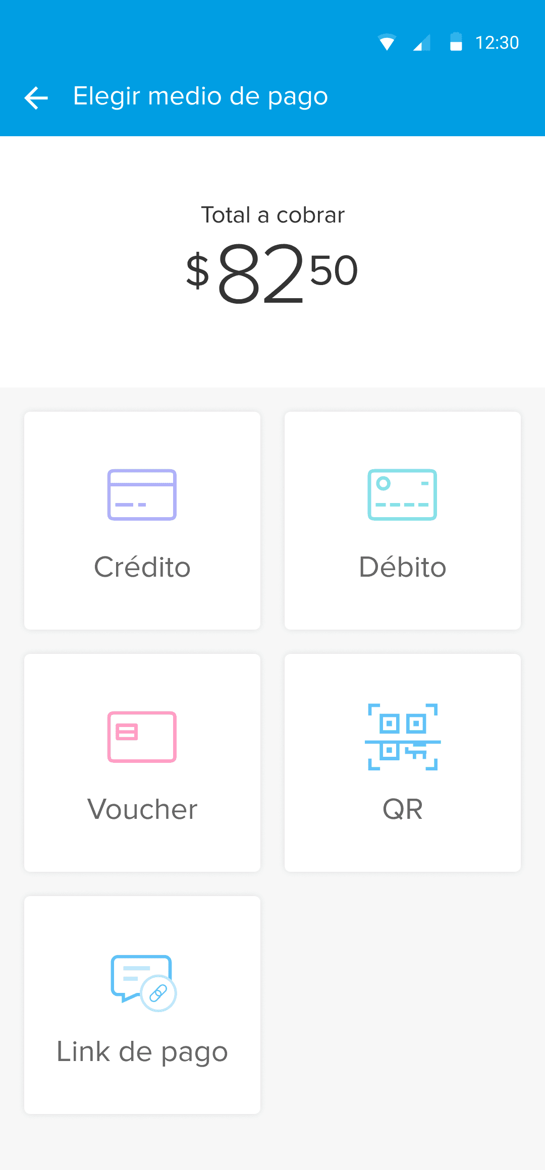
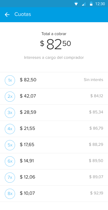
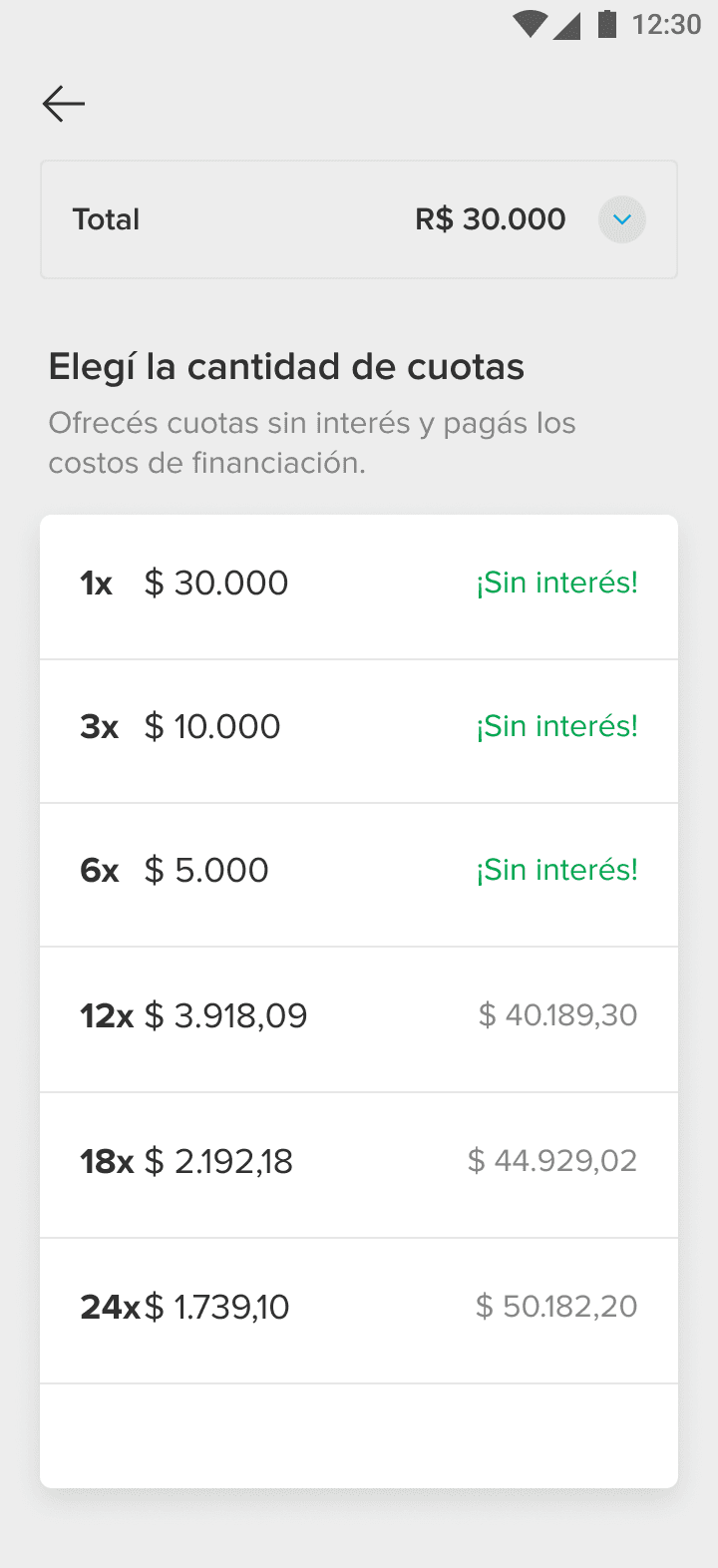
Accessibility and affordance
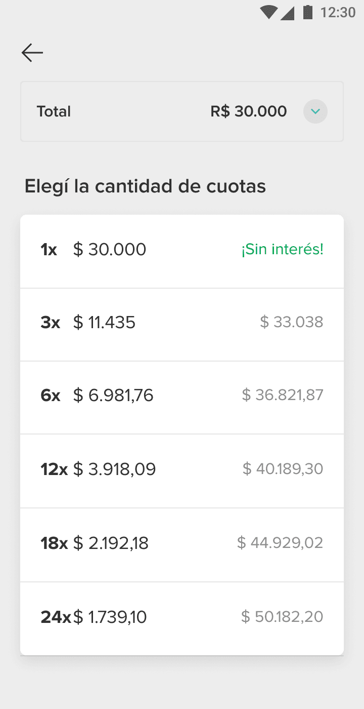
Usability reports revealed that users heavily rely on color recognition with icons. For the payment method selector, I introduced a brighter, more accessible color palette.
In the installment selection step, I removed circles to improve legibility and increased the contrast of the typeface. Promotions and interest-free options were highlighted in green for better visibility.
Performance
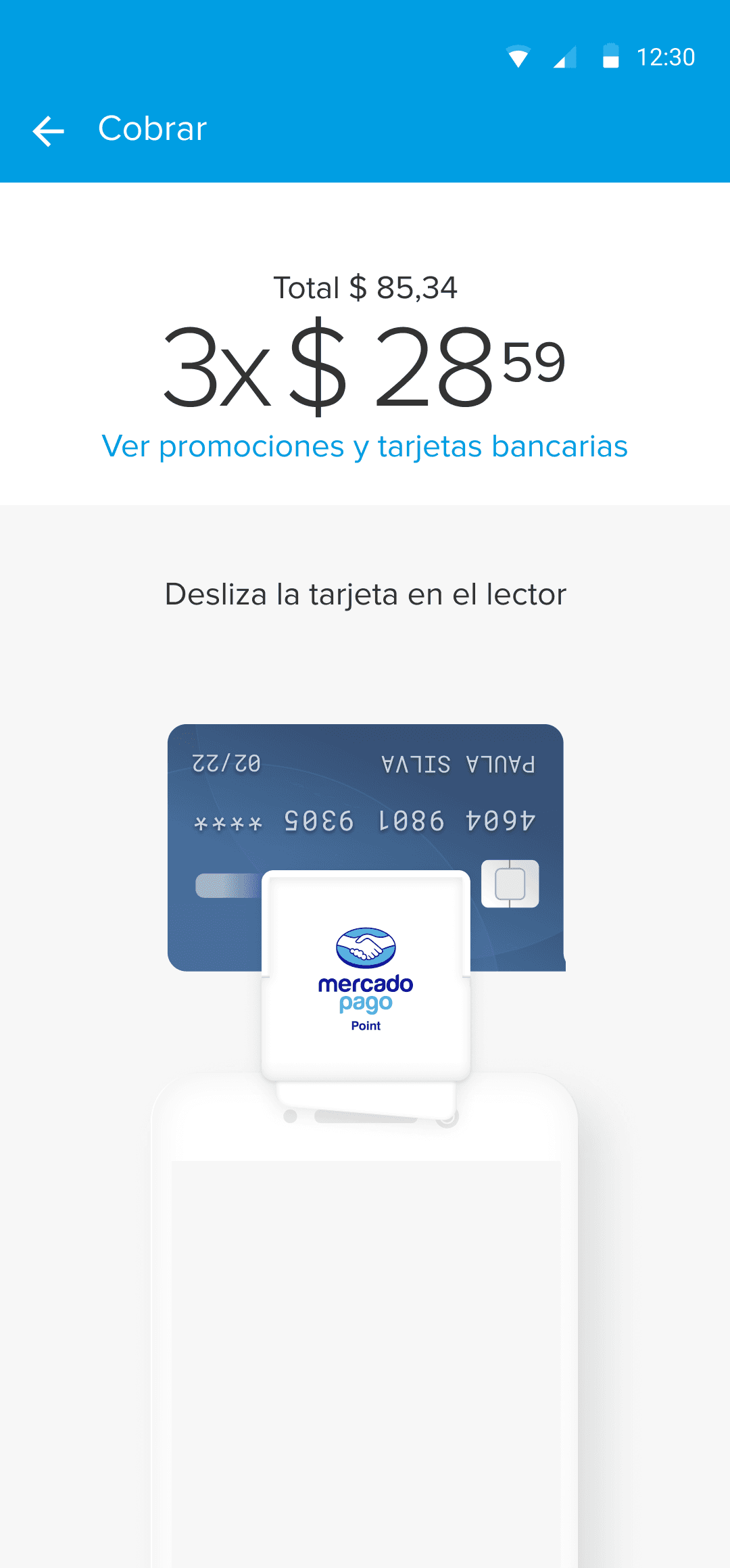
The card-reading step originally used an animation to guide users on how to read the card, but it was outdated and caused performance issues on some smartphones due to the use of layers and shading.
I created a minimal looping animation, aligned with the brand’s illustration guidelines, that is much lighter and performs better.
Before
After

Focus on action
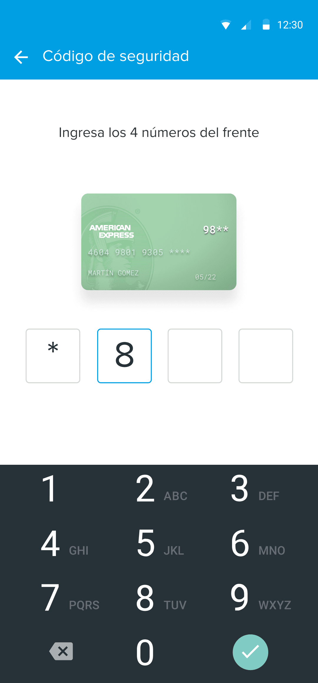
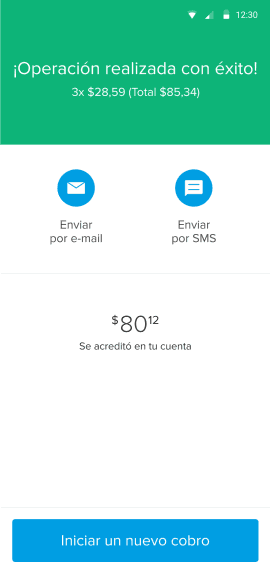
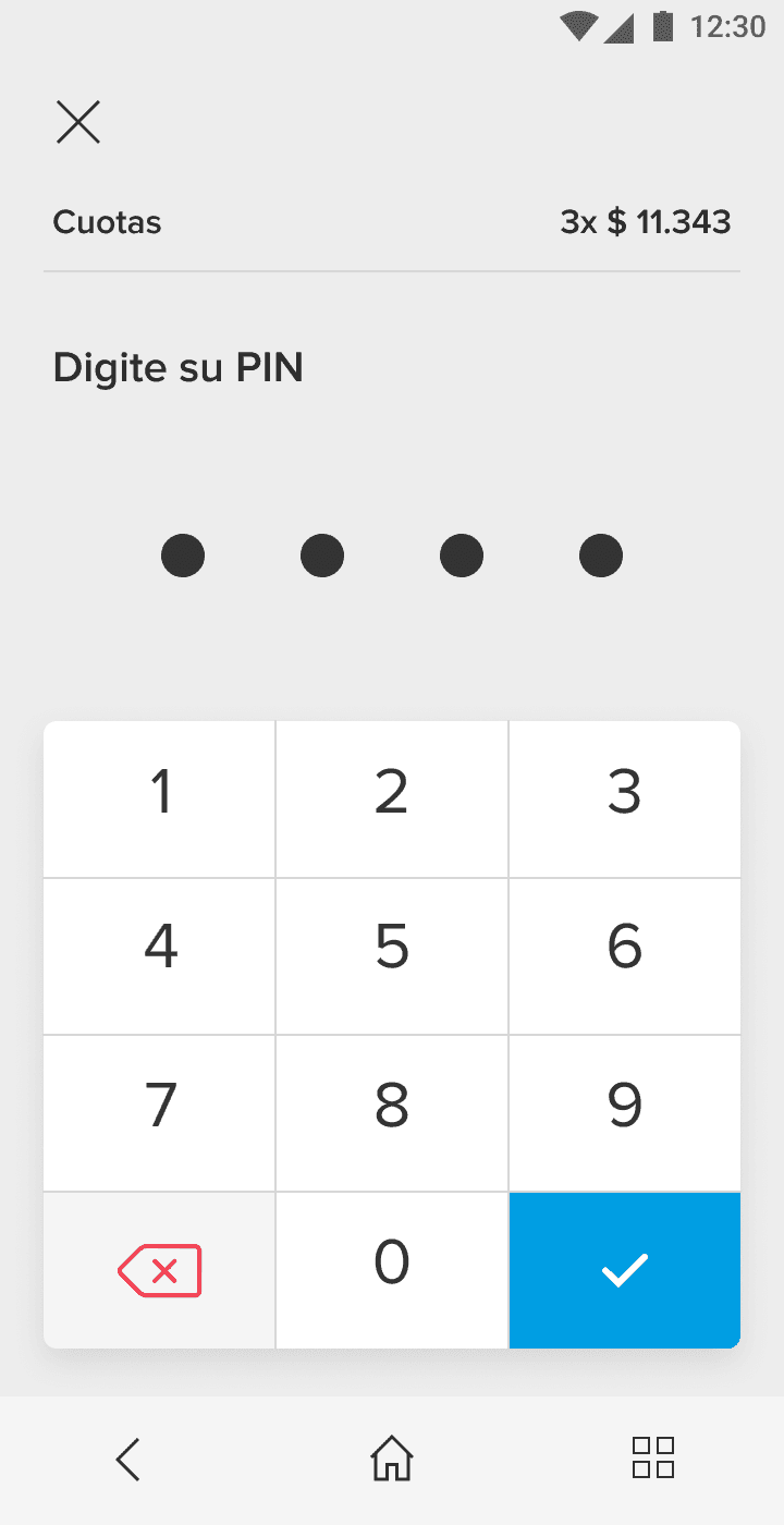
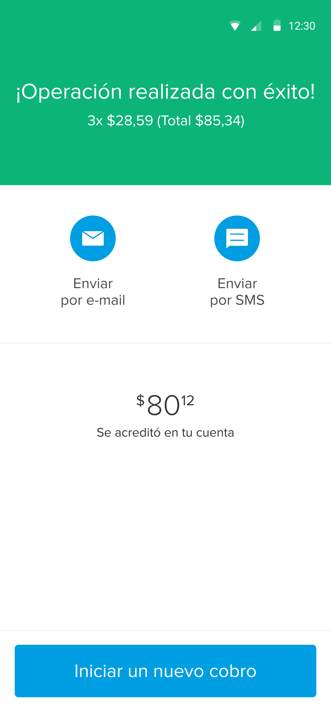
For customer-facing screens, such as those involving security steps, we emphasized the instructions.
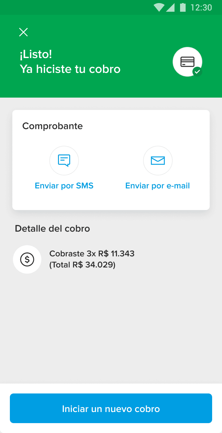
On the PIN screen, I designed a custom keyboard with recognizable color coding on the buttons (submit and delete). For the success screen, I improved the information hierarchy and enhanced the affordance for receipt-sharing options.
Results
Final flow

Dev hand off
To ensure developers understood how to build the new flow layout was crucial, I created a dedicated section in the Figma file for handoff, detailing construction specifications for each screen.
I also included a flowchart for the payment process in each country, as well as all variations of each step. Previously, this information wasn’t centralized, which led to frequent inquiries from other teams. Having everything documented in a single source was a major workflow improvement.
I set up all components as a library, allowing other designers to easily use them for mockups and to adapt the flow for different use cases.

Impact
3 countries
Rolled out progressively in 3 countries within 3 months.
+2 countries
Enabled faster launches in 2 additional countries.
-50%
Reduced time-to-market for new features by 50%.
Optimized
Processing times and improved battery performance on devices.
+
Design guidelines were scaled to other POS terminals, ensuring consistency across products.